CSS Flex vs Grid Layout Explained with Examples & Tips
Compare CSS Flexbox vs CSS Grid fast. Simple broken English guide with clear comparison table, visual live examples, practical tips, and related posts that open in new tab.
2026-10-07 · 6 min read
CSS Flexbox and CSS Grid are two super powerful layout tools in modern CSS. Many developer ask: "When to use Flexbox? When to use Grid?"
Short answer: Flexbox is 1D (1 Direction). Grid is 2D (2 Directions).
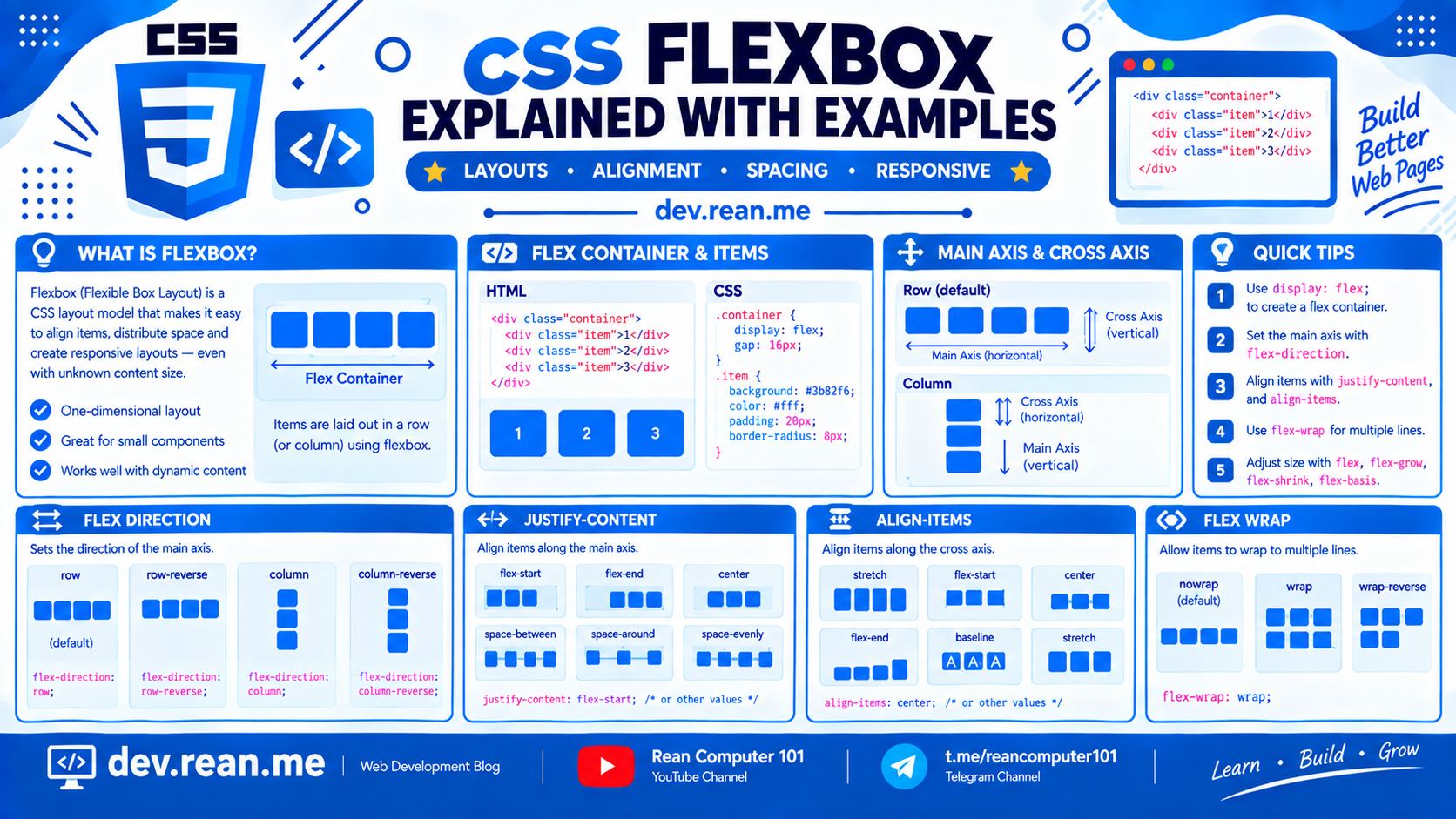
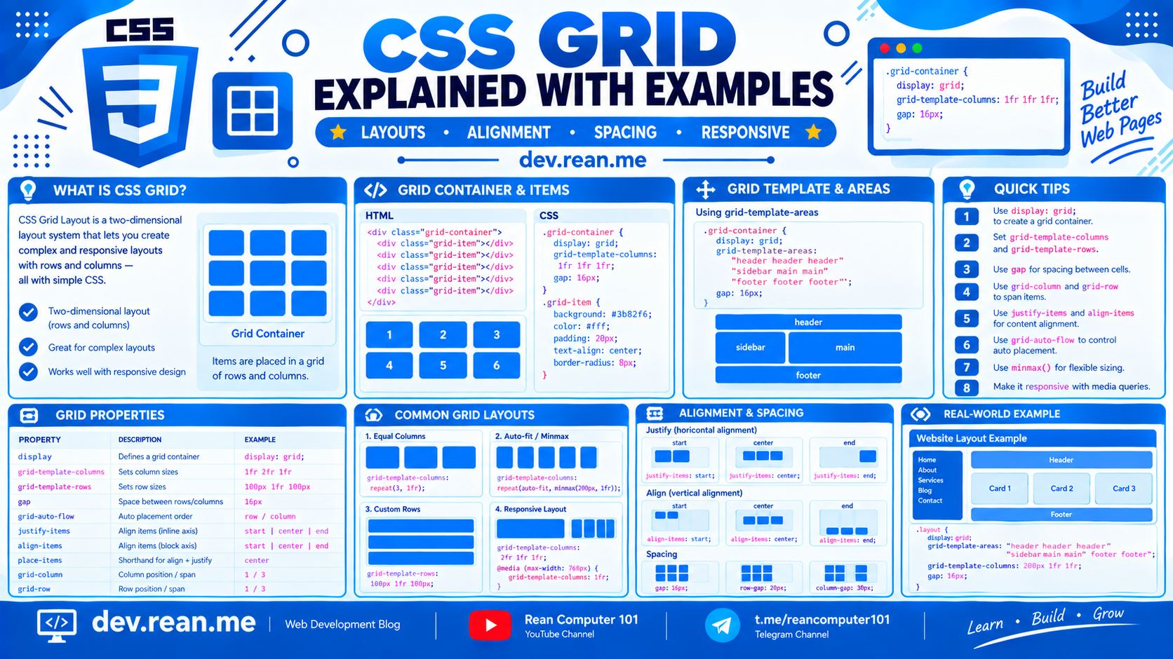
Here is a short, clear, visual guide to master CSS Flexbox vs Grid fast! 🚀
⚡ Flex vs Grid: Quick Comparison Table
| Feature | CSS Flexbox | CSS Grid |
|---|---|---|
| Dimension | 1D (Row OR Column) | 2D (Row AND Column together) |
| Best Use Case | Small components (Navbar, buttons, items list) | Big layout structure (Page template, card gallery, dashboard) |
| Content vs Layout | Content-first (Items grow/shrink based on text) | Layout-first (Parent define columns/rows structure first) |
| Item Overlap | Hard (need position: absolute) | Easy (just put items in same grid cell) |
| Responsive | Easy with flex-wrap: wrap | Easy with repeat(auto-fit, minmax(...)) |
💡 Core Concept: 1D vs 2D
1. Flexbox (1D - Line Layout)
Flexbox arrange items in one line at a time (horizontal row OR vertical column).
Flex Row: [ Item 1 ] [ Item 2 ] [ Item 3 ]
2. CSS Grid (2D - Grid Matrix)
Grid arrange items in rows AND columns at same time.
Grid 2x3:   [ Item 1 ] [ Item 2 ] [ Item 3 ]
            [ Item 4 ] [ Item 5 ] [ Item 6 ]
📦 Practical Examples
Example 1: Navigation Bar (Flexbox is King 👑)
When you build navbar with logo on left and buttons on right, Flexbox is best.
.navbar {
  display: flex;
  align-items: center;
  gap: 16px;
}

.login-btn {
  margin-left: auto; /* Push button to right side! */
}
⚡ Live Result Preview:
Example 2: Auto-Responsive Card Gallery (Grid is King 👑)
When you want cards layout that auto resize without media query, CSS Grid is best.
.card-gallery {
  display: grid;
  grid-template-columns: repeat(auto-fit, minmax(180px, 1fr));
  gap: 16px;
}
⚡ Live Result Preview:
Example 3: Sticky Sidebar + Main Content (Sidebar Stay on Scroll)
To make sidebar stay in place (not scroll along with content), add position: sticky; top: 16px; align-self: start;!
.layout {
  display: grid;
  grid-template-columns: 200px 1fr;
  gap: 16px;
}

/* Sidebar stay fixed when page scroll! */
.sidebar {
  position: sticky;
  top: 16px;        /* Distance from top screen */
  align-self: start; /* Prevent grid item stretching */
}
⚡ Live Result Preview:
🎯 5 Golden Tips for Flexbox vs Grid
Tip 1: Simple Rule of Thumb
- Use Flexbox for small UI components (navbar, tag lists, button groups, modal actions).
- Use CSS Grid for overall page layout (header/sidebar/content, photo wall, product list).
Tip 2: Combine Both Flex and Grid!
No need to pick only one! Best websites use Grid for outer page, and Flexbox for inner components.
/* Outer layout with Grid */
.dashboard {
  display: grid;
  grid-template-columns: 240px 1fr;
}

/* Inner header with Flexbox */
.header {
  display: flex;
  justify-content: space-between;
}
Tip 3: Perfect Centering Trick
- Grid (1 line):
.container { display: grid; place-items: center; } - Flex (2 lines):
.container { display: flex; justify-content: center; align-items: center; }
Tip 4: Layering Elements (Grid Wins!)
Want image with text overlay? Grid can stack elements inside same cell easily without position: absolute:
.hero-card {
  display: grid;
}

.hero-img, .hero-text {
  grid-column: 1;
  grid-row: 1; /* Both sit in same cell! */
}
Tip 5: Forget float and clearfix
Never use float: left or clearfix hacks in modern web design. Flexbox and Grid work in all modern browsers and much easier to maintain!
📥 Cheat Sheet Downloads (High Quality 2K)
🌐 Related Posts & Useful Links
All links open in new tab:
📚 Official Docs & Interactive Tools (New Tab)
- MDN Web Docs — CSS Flexbox Guide
- MDN Web Docs — CSS Grid Layout Guide
- Flexbox Froggy — Learn Flexbox by Game
- Grid Garden — Learn CSS Grid by Game
🏷️ Related CSS Tutorials on dev.rean.me (New Tab)
- CSS Flexbox Explained: Short & Clear Guide with Examples & Pro Tips
- CSS Grid Explained: Short & Clear Guide with Examples & Pro Tips
- CSS Positioning Explained: Static, Relative, Absolute, Fixed & Sticky
- CSS Cheat Sheet: Essential Syntax, Box Model & Properties
- CSS Tips and Tricks with Practical Code Examples
- How to Build a Responsive CSS Dropdown Menu & Submenu
Happy layout building! Hope this short & clear CSS Flex vs Grid guide help you! 🎨⚡