CSS Flexbox Explained: Short & Clear Guide with Examples, Pro Tips & Related Posts
Master CSS Flexbox layout fast with short, clear visual examples, flex container & item properties, practical UI tips, and curated related posts that open in a new tab.
2026-10-02 · 8 min read
CSS Flexbox (Flexible Box Layout) is a 1-dimensional layout module designed to arrange elements in rows or columns. It makes aligning, spacing, and sizing elements effortless without relying on complex float hacks or fixed calculations.
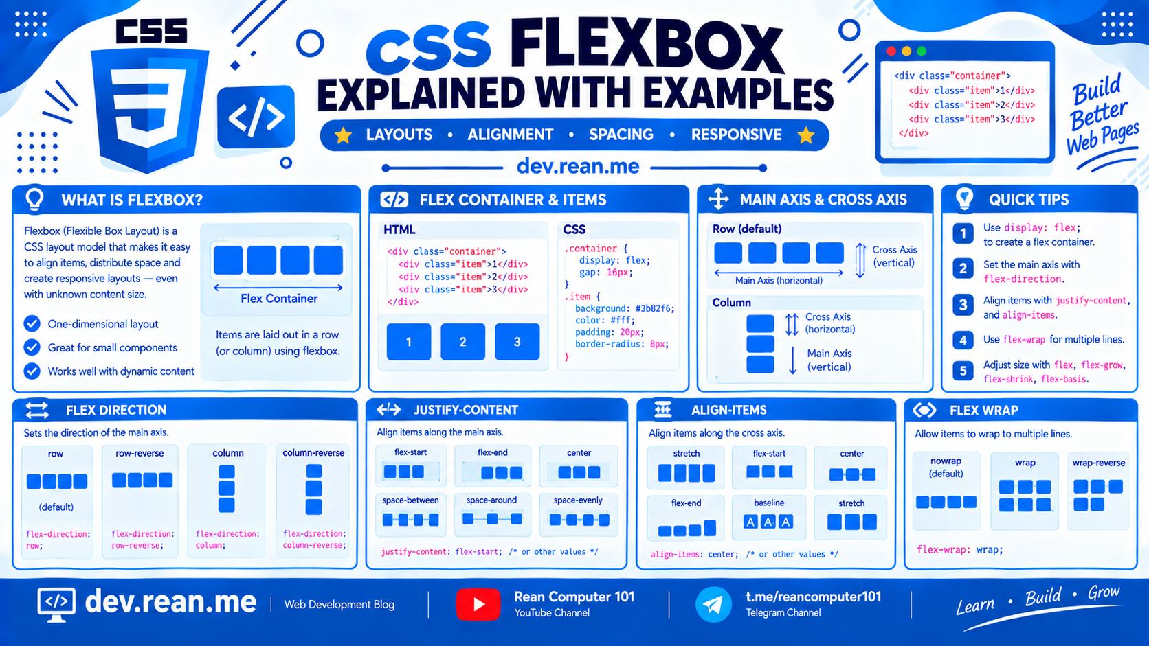 Download the image of CSS Flexbox Cheat Sheet 2K Quality at the bottom of this post.
Here is a short, clear, and visual guide to mastering CSS Flexbox in minutes. 🚀
💡 Core Concept: Main Axis vs. Cross Axis
Understanding Flexbox comes down to understanding two axes:
- Main Axis: The primary direction flex items follow. Horizontal by default (
row), vertical if set tocolumn. - Cross Axis: The perpendicular direction to the main axis (vertical when row, horizontal when column).
         MAIN AXIS (flex-direction: row)
   ----------------------------------------->
  +------------------------------------------+
  |  [Item 1]    [Item 2]    [Item 3]       |  |
  +------------------------------------------+  | CROSS AXIS
                                                v
⚡ Quick Cheatsheet
| Role | Property | Key Options / Values | What It Controls |
|---|---|---|---|
| Parent Container | display | flex | inline-flex | Enables flex context |
flex-direction | row | column | row-reverse | column-reverse | Main axis direction | |
justify-content | flex-start | center | flex-end | space-between | space-around | space-evenly | Align along Main Axis | |
align-items | stretch | center | flex-start | flex-end | baseline | Align along Cross Axis | |
flex-wrap | nowrap | wrap | wrap-reverse | Multi-line wrapping | |
gap | 16px | 1rem | 10px 20px | Distance between items | |
| Child Item | flex | 1 (shorthand for grow, shrink, basis) | Flexible sizing |
align-self | auto | flex-start | center | flex-end | stretch | Override container alignment | |
order | Integer (-1, 0, 1, 2) | Visual display order |
📦 Parent Container Properties
1. display: flex
Turns the container into a flex container, converting all immediate children into flex items.
.container {
  display: flex;
}
2. flex-direction
Defines the main axis direction (horizontal row vs. vertical column).
.container-row {
  display: flex;
  flex-direction: row; /* Default */
}

.container-column {
  display: flex;
  flex-direction: column;
}
⚡ Live Result Preview:
3. justify-content (Main Axis Alignment)
Aligns flex items along the Main Axis.
.container {
  display: flex;
  justify-content: space-between; /* flex-start | center | flex-end | space-between | space-around | space-evenly */
}
⚡ Live Result Previews:
4. align-items (Cross Axis Alignment)
Aligns flex items along the Cross Axis (vertically in a row container).
.container {
  display: flex;
  align-items: center; /* stretch | flex-start | center | flex-end | baseline */
}
⚡ Live Result Preview:
5. flex-wrap and gap
Controls whether items wrap onto multiple lines and defines the exact spacing between items.
.container {
  display: flex;
  flex-wrap: wrap; /* Allows wrapping on smaller screens */
  gap: 16px;       /* Sets spacing between rows & columns cleanly */
}
🧩 Flex Child Item Properties
1. flex: 1 (Shorthand for Grow, Shrink, Basis)
Tells an item to expand and take up all available space inside the container.
.sidebar {
  width: 250px; /* Fixed width */
}

.main-content {
  flex: 1; /* Takes up all remaining space */
}
⚡ Live Result Preview:
2. align-self
Allows a single child item to override the container's align-items setting.
.container {
  display: flex;
  align-items: flex-start;
}

.special-item {
  align-self: flex-end; /* Pulls this item to the bottom */
}
3. order
Changes the visual display order of items without modifying HTML markup. Default is 0.
.item-first {
  order: -1; /* Appears before everything else */
}
🎯 5 Essential Flexbox Pro Tips
Tip 1: The Ultimate 3-Line Vertical & Horizontal Center
Forget absolute positioning hacks. Center any element inside a container with 3 lines of CSS:
.centered-container {
  display: flex;
  justify-content: center;
  align-items: center;
}
Tip 2: Use margin-left: auto for Navbars & Cards
Using margin-left: auto on a flex item automatically consumes all available space on its left, pushing it directly to the far right edge!
.navbar {
  display: flex;
  align-items: center;
  gap: 16px;
}

.login-btn {
  margin-left: auto; /* Pushes button to right side of navbar */
}
⚡ Live Result Preview:
Tip 3: Automatic Equal-Height Cards
By default, flex items stretch to match the height of the tallest sibling item (align-items: stretch). This makes creating uniform feature cards effortless without hardcoding heights!
Tip 4: Modern Sticky Footer Layout
Keep your page footer pinned at the bottom of the viewport on short pages:
body {
  min-height: 100vh;
  display: flex;
  flex-direction: column;
}

main {
  flex: 1; /* Grows to fill available empty height */
}
Tip 5: Prefer gap Over margin
Always use gap: 12px; on flex containers instead of adding margin-right to items. gap automatically excludes outer edges, preventing layout overflow issues.
CSS Flexbox Cheat Sheet 2K Quality
⬇️ Click here to download CSS Flexbox Cheat Sheet 2K Quality
🌐 Related Posts & Useful Resources
Explore these official references, interactive tools, and related CSS guides. All external and internal reference links open in a new tab.
📚 Official CSS Specs & Learning Games (New Tab)
- MDN Web Docs — CSS Flexible Box Layout Guide
- CSS-Tricks — Complete Guide to Flexbox
- Flexbox Froggy — Interactive Game to Learn CSS Flexbox
- W3C CSS Flexible Box Layout Module Specification
🏷️ Related CSS Tutorials on dev.rean.me (New Tab)
- CSS Positioning Explained: Static, Relative, Absolute, Fixed & Sticky
- CSS Cheat Sheet: Essential Syntax, Box Model & Properties
- How to Build a Responsive CSS Dropdown Menu & Submenu
- CSS Tips and Tricks with Practical Code Examples
- Complete CSS Property & Selector Reference Guide
Happy layout building! If you found this short & clear CSS Flexbox guide helpful, feel free to share it with fellow developers! 🎨⚡