CSS Grid Explained: Short & Clear Guide with Examples, Pro Tips & Related Posts
Master CSS Grid layout fast with short, clear visual examples, grid container & item properties, auto-fit responsive tricks, practical UI tips, and curated related posts that open in a new tab.
2026-10-02 · 7 min read
CSS Grid Layout is a powerful 2-dimensional layout system for the web. Unlike Flexbox (which handles 1-dimensional rows OR columns), CSS Grid allows you to control both rows AND columns simultaneously, making complex page designs clean and easy to maintain.
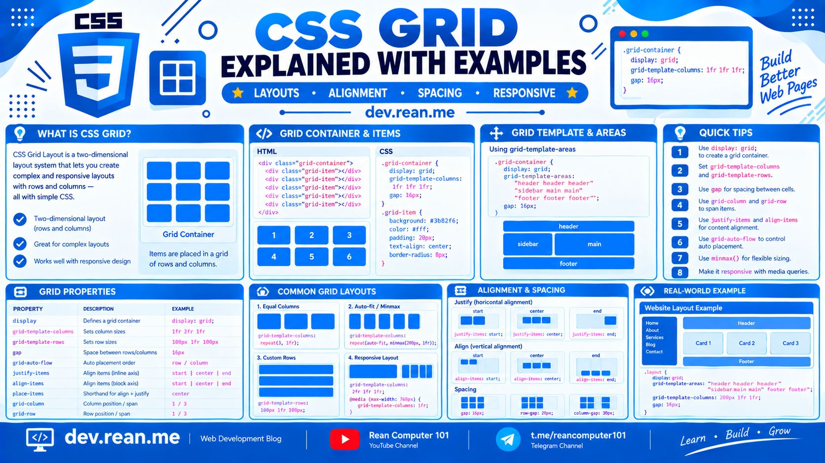 Download the image of CSS Grid Layout at the bottom of this post.
Here is a short, clear, and visual guide to mastering CSS Grid in minutes. 🚀
💡 Core Concept: 2D Grid System
CSS Grid works with a parent grid container and child grid items. You define the structure on the parent, and children automatically place themselves into grid cells.
          COLUMN 1        COLUMN 2        COLUMN 3
       +---------------+---------------+---------------+
ROW 1  |  Grid Cell    |  Grid Cell    |  Grid Cell    |
       +---------------+---------------+---------------+
ROW 2  |  Grid Cell    |  Grid Cell    |  Grid Cell    |
       +---------------+---------------+---------------+
⚡ Quick Cheatsheet
| Role | Property | Key Options / Values | What It Controls |
|---|---|---|---|
| Parent Container | display | grid | inline-grid | Enables grid context |
grid-template-columns | repeat(3, 1fr) | 200px 1fr | repeat(auto-fit, minmax(200px, 1fr)) | Track widths of columns | |
grid-template-rows | 100px auto 50px | repeat(2, 1fr) | Track heights of rows | |
gap | 16px | 20px 10px | Distance between cells | |
grid-template-areas | "header header" "sidebar main" | Visual area layout mapping | |
place-items | center | stretch | Shorthand for align-items + justify-items | |
| Child Item | grid-column | 1 / 3 | span 2 | 1 / -1 | Column span from start to end line |
grid-row | 1 / 3 | span 2 | Row span from start to end line | |
grid-area | header | main | sidebar | Assign item to named area | |
place-self | center | stretch | Individual cell alignment |
📦 Grid Container Properties
1. display: grid & grid-template-columns
The fr unit represents a fraction of available space inside the grid container.
.grid-container {
  display: grid;
  grid-template-columns: 1fr 1fr 1fr; /* 3 equal columns */
  /* Or using shorthand: repeat(3, 1fr) */
  gap: 16px;
}
⚡ Live Result Preview:
2. Fixed & Flexible Columns (200px 1fr)
You can mix fixed sizes (px, rem) with flexible fractional units (fr).
.sidebar-layout {
  display: grid;
  grid-template-columns: 200px 1fr; /* Fixed sidebar, expanding main content */
  gap: 16px;
}
⚡ Live Result Preview:
3. Named Layout Areas (grid-template-areas)
Create visual layout templates right inside your CSS!
.layout {
  display: grid;
  grid-template-areas:
    "header  header"
    "sidebar content"
    "footer  footer";
  grid-template-columns: 180px 1fr;
  gap: 12px;
}

.header  { grid-area: header; }
.sidebar { grid-area: sidebar; }
.content { grid-area: content; }
.footer  { grid-area: footer; }
⚡ Live Result Preview:
🧩 Grid Item Placement
grid-column & grid-row Spanning
You can control where an item starts and ends using grid line numbers or span.
.hero-card {
  grid-column: 1 / 3; /* Spans from grid column line 1 to 3 */
  /* Or: grid-column: span 2; */
}

.full-width-card {
  grid-column: 1 / -1; /* Spans from line 1 all the way to the last line */
}
⚡ Live Result Preview:
🎯 5 Essential CSS Grid Pro Tips
Tip 1: The Magic Responsive Grid (Zero Media Queries!)
Create fully responsive grid cards that adapt automatically to any screen width without writing a single @media rule!
.responsive-grid {
  display: grid;
  grid-template-columns: repeat(auto-fit, minmax(240px, 1fr));
  gap: 20px;
}
💡 How it works:
auto-fitfits as many columns as possible, whileminmax(240px, 1fr)ensures columns are never smaller than240pxand stretch to fill remaining room.
Tip 2: 1-Line Perfect Centering (place-items: center)
Want to center content vertically and horizontally inside a container? Use place-items: center:
.hero-banner {
  display: grid;
  place-items: center;
  min-height: 250px;
}
Tip 3: Stack & Layer Elements Without position: absolute
Place multiple elements into the exact same grid cell line numbers to layer them on top of each other!
.card-stack {
  display: grid;
}

.card-image,
.card-overlay {
  grid-column: 1;
  grid-row: 1; /* Both sit in cell (1, 1) */
}
Tip 4: Use 1fr Instead of 100%
Avoid using width: 100% inside grid cells, as margins and padding can cause grid items to overflow. 1fr automatically accounts for column gaps and paddings safely!
Tip 5: When to Use Grid vs. Flexbox?
- Use Flexbox when: You need 1D alignment (navbars, button groups, icon lists).
- Use CSS Grid when: You need 2D layout control (page templates, photo galleries, dashboard widgets, pricing tables).
CSS Grid Cheat Sheet 2K Quality
⬇️ Click here to download CSS Grid Cheat Sheet 2K Quality
🌐 Related Posts & Useful Resources
Explore these official documentation links, interactive games, and related tutorials on our platform. All external and internal reference links open in a new tab.
📚 Official CSS Grid Specs & Interactive Games (New Tab)
- MDN Web Docs — CSS Grid Layout Complete Guide
- CSS-Tricks — A Complete Guide to CSS Grid
- Grid Garden — Interactive Game to Learn CSS Grid
- W3C CSS Grid Layout Module Specification
🏷️ Related CSS Tutorials on dev.rean.me (New Tab)
- CSS Flexbox Explained: Short & Clear Guide with Examples & Pro Tips
- CSS Positioning Explained: Static, Relative, Absolute, Fixed & Sticky
- CSS Cheat Sheet: Essential Syntax, Box Model & Properties
- How to Build a Responsive CSS Dropdown Menu & Submenu
- CSS Tips and Tricks with Practical Code Examples
- Complete CSS Property & Selector Reference Guide
Happy coding! If you found this short & clear CSS Grid guide helpful, feel free to share it with fellow developers! 🎨⚡